 Oppo N1 Review
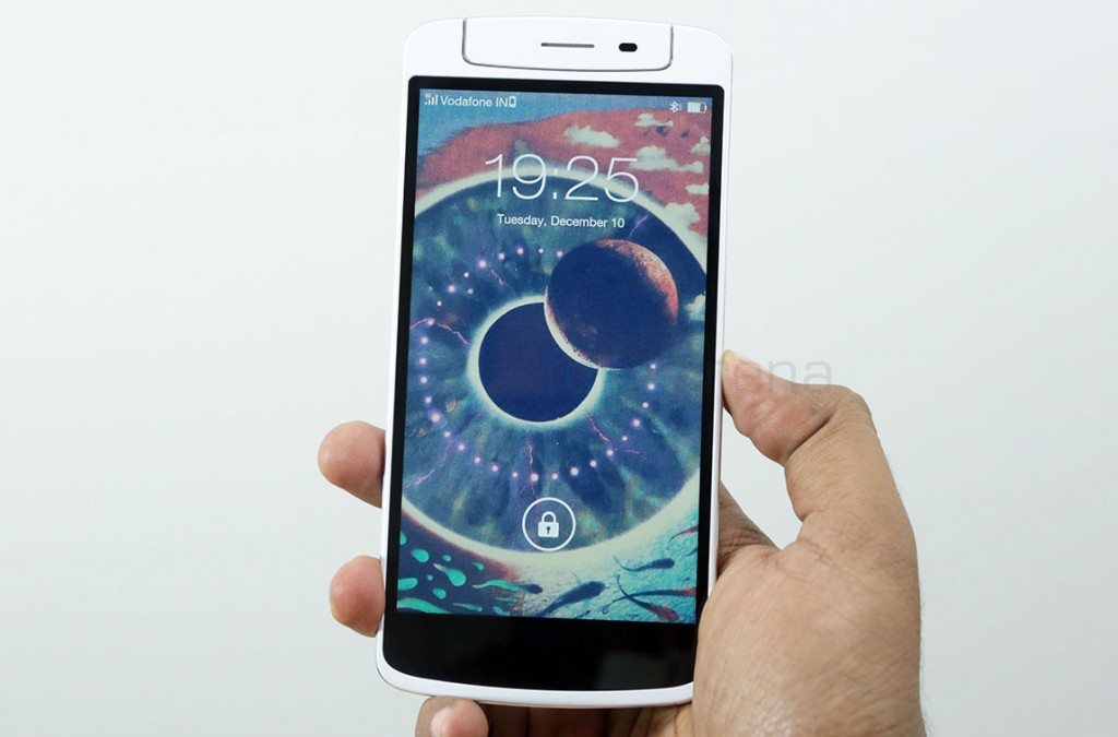
After a long period of leaks and teasers, Oppo finally announced its latest flagship device, the Oppo N1 in September. The N1, initially believed to be camera-centric, ended up as a well rounded flagship device for the company. Innovations like the O-Touch rear sensor and the unique rotating swivel unit for the camera made sure that the N1 is not just another Android phone, and has a number of firsts worth looking at. Yes, it is a potential trend setter, but is also a trend follower. With a huge 5.9 inch screen, the N1 brings Oppo to proper phablet territory, addressing the growing trend of massively sized phones that bridge the gap between phones and the most popular form factor in tablets. Makes Oppo one of the first companies to go with this approach for a flagship device. The N1 is a phablet, which is currently considered a niche, but one that represents everything Oppo stands for. But the big question is, at a starting price of 599$, does it have the potential to rival the best Android hardware in the market? Lets find out in our in-depth review.
Video
Unboxing
Like any other Oppo device, the N1 too comes in a classy box, with minimalistic design and packaging. Here are the box contents laid out in a single picture -
- Oppo N1 in white
- In-ear headset with mic
- Travel Charger
- Micro USB cable
- SIM ejector tool
- User manual and Quick Guide
- O-Click Bluetooth Remote in a separate box, with battery
You can check out our full unboxing and first impressions for a better look at the box contents and a glimpse what we had thought about the N1 immediately after taking it out of the box.
Design, Build and Ergonomics
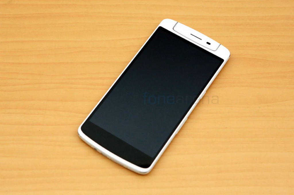
We loved Oppo’s minimalistic approach in design with the Find 5. It was one of the factors that truly set it apart from other Android devices. The Find 5 was designed in such a way that the content on the screen took center stage, and deservedly so, as it was one of the first 1080p screens in the world, which naturally warranted that decision, but the N1 is something else. There’s a lot going on here, like the swiveling camera, the rear touch sensor and so on, so it had to be different, and it is, but at the same time, does not eschew from the usual touchscreen phone design. The device, in white, has a frame around the screen with bezels in unsymmetrical proportions. Sure, the display takes most of the space and technically center stage on the N1 too, but notice how the display’s dark bezels give way for the rotating camera, and don’t blend in with the rest of the phone. So, basically what Oppo is conveying here is, the phone is much more than just the display, and it shows. Also, about the unsymmetrical design, it would have been worse if the bezels didn’t extend to the capacitive buttons, because that would have just made the phone larger, purely due to perception.
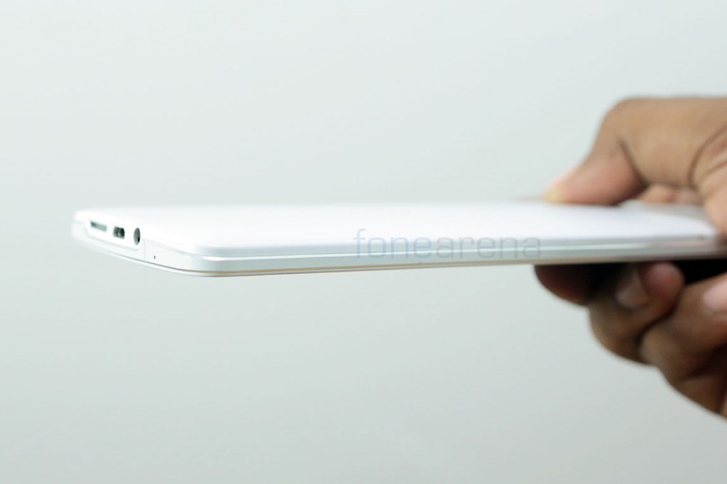
Coming to build quality, the Oppo N1 is predominantly made of metal. A rigid aluminium frame, with neat chamfered edges, fortifies the device, running through the sides, and is sandwiched between the top and bottom parts. The part on the top is glass and plastic, while the bottom is made to feel like ceramic. The bottom part, or the back of the device, intrigued us, as it didn’t exhibit properties of any material we knew and used. It’s smooth and has a matte finish, adding a whole level of premium to the device. We then found that it is actually metal, as it felt cold to touch when the room temperature started dipping. Plastics usually don’t conduct heat as much, so that lends evidence to the fact that the back too is made of metal, only feels like ceramic, which is a huge win for a premium look and feel. That aside, the quality is still unmatched, as the N1 evoked similar feelings as the Find 5. It definitely felt like one of the best built phones we have ever handled. But talking of handling, this is where the going gets tough.
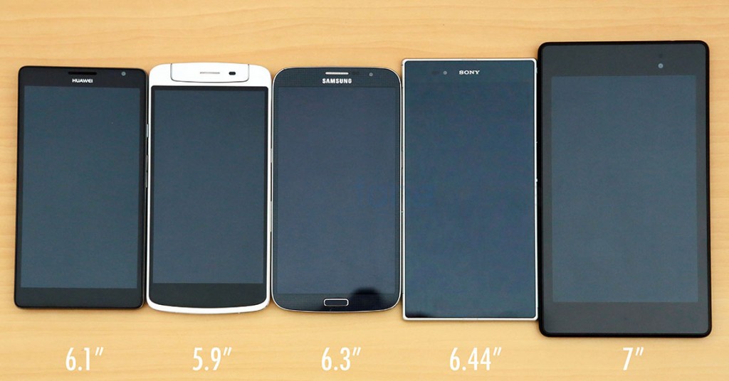
The Oppo N1 is big, and that is an understatement. When compared with similarly sized phablet devices, we found the N1 to have a larger or similar foot print, even with a smaller screen. The dimensions of the device go like -
- 170.7 x 82.6 x 9 mm Weight – 213g
For perspective, lets compare it with the Galaxy Mega 6.3, which sports these dimensions – 167.6 x 88 x 8 mm Weight – 199 g
As you can see above and from the dimensions, the Oppo N1 is taller and heavier than the Mega 6.3, even with a smaller screen in comparison.
For another perspective, lets compare it with the iPhone 5s, which has these dimensions – 123.8 x 58.6 x 7.6 mm Weight – 112 g
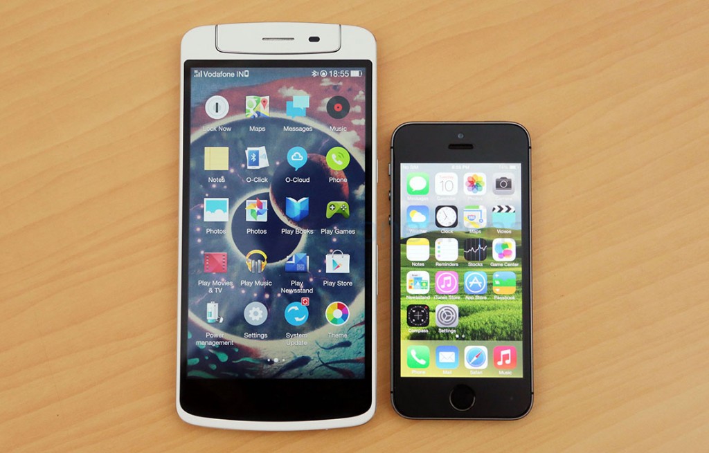
Now you know how big the Oppo N1 is. Like we mentioned earlier, the N1 is not just big, it is heavy too. At 213g of weight, the N1 is one of the heaviest phones we have used, only to be surpassed by the HTC One Max. We had noted in our Galaxy Mega 6.3 review how huge phablets are a pain in terms of usability, and unsurprisingly, it stays true for the N1 too. The device is well built, but the weight is something they could have taken care of. Unless held right, the device feels top-heavy and always gives the uncomfortable feeling of toppling. We had to be really really careful in not dropping this device, because that’s exactly what we did, with the Mega 6.3. The N1 is unwieldy, even for large hands like mine, and the slippery smooth back doesn’t help with the grip either. But the reality is people continue to use large devices such as these, with carry cases and other covers of their choices, so that might mitigate the normal phone-like usage we subjected it to.
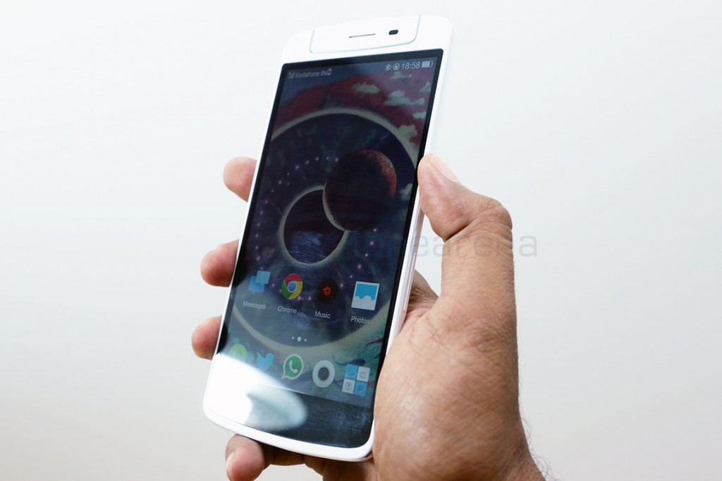
In the end, it’s clear that the N1 is for the ones who prefer a huge phablet, hopefully with hands large enough to accommodate the device, or use other ways to tackle that problem. But if you are on the other camp, and prefer only flagship devices with a 5 inch screen or less, the Oppo N1 might be not worth the pursuit. With that in mind, lets move on and see what the overall hardware is like.
Hardware Walkthrough
A single sheet of glass engulfed in a plastic frame represents the large front of the Oppo N1.
We have a 5.9 inch full HD display underneath the corning gorilla glass 3 screen, with capacitive shortcut buttons below. They are backlit and offer haptic feedback when pressed, but we felt the feedback is too feeble.
Above the display, we have the rotating swivel unit that can rotate 206 degrees, bringing the camera unit to the front when needed. In its normal position, the grilled earpiece and the pair of sensors of ambient light and proximity sensing take up the space, while the camera unit and the dual LED flash take the space otherwise.
It is important to note that the swivel is not centered, so rotating the unit will introduce a gap between the unit and the rest of the phone. Adding to that, there is no sign of a notification LED anywhere here or elsewhere on the device.
Due to the presence of a rotating unit, you have nothing on the top of the device, but on the left, you can see a micro SIM tray that can be opened with a SIM ejector tool, provided inside the box. The aluminium frame is clearly visible here, with chamfered edges giving it a premium look.
The bottom is crowded with the primary microphone, the micro USB port and the grilled loudspeaker. You can also notice the two joints between the different pieces of aluminium, which also act as antenna boosters.
Over at the right side, we have the volume rocker and the power/lock switch that are placed well below than usual, for easy reach. Much needed change of placement right there, and we are thankful that Oppo took this into consideration.
Coming to the back of the device, we have the 13 megapixel camera unit sitting in its usual position, with dual LED flash, and below it, we have the secondary microphone for stereo recording and the Oppo insignia.
Just below the logo is the OTouch rear touch sensor, a small 12cm^2 area which can recognize your touch. This is marked by an icon and has dotted borders for easy recognition by touch. Otherwise, the back is completely minimalistic and adds to the look of the device. That concludes the hardware walkthrough, lets move on to the finer details.
Display
The Oppo Find 5 was one of the first devices to sport a full HD 1080p resolution display, and it was glorious, as we had noted in our review. Naturally, we had high expectations for the N1. The N1 too comes with a full HD display, but is much larger at 5.9 inches of screen real estate. It is built on the ubiquitous IPS LCD technology but curiously lacks OGS(One Glass Solution) that made the Find 5′s display so much better. But that doesn’t mean the N1′s display is bad, because it’s really awesome on its own. It has great colour reproduction in all the viewing angles and has apt brightness and contrast to make the images pop. We didn’t see colour casts or any sort of distortion in any viewing angles, only the brightness reduces due to the apparent air gap, which is slightly mitigated by a higher setting in brightness.
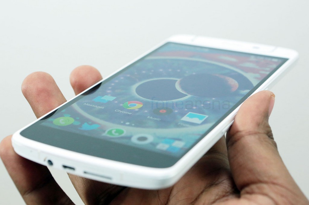
At 377 PPI, it is hard to see individual pixels, so the display is quite sharp and is great for reading and general consumption of media. Talking of media, it’s great for watching videos as well, thanks to the 16:9 aspect ratio and the large screen, even YouTube videos felt really immersive to watch on this screen. As expected, the display is a great fit for any type of consumption, and the phone is made for this, so no complaints there. We were hoping to be wowed because of the higher expectations but only ended up pleasantly surprised by the display. This might not be the best display you will see, but is certainly very good and devoid of any issues. Believe us, we really tried hard to find issues.
Camera
Before the official announcement, there were a lot of rumours that Oppo was going to revolutionize camera phones with its N series of devices. We got to know from the reveal that the Oppo N1 sports a 13 Megapixel camera, eerily similar to the one on the Find 5. But on closer inspection, we find that the sensor is the same, but everything else is different. The Sony EXMOR RS 13 MP sensor is a 1/3.06″ unit, atop which sits the six-element lens which might be a first for Android devices. The lens has an aperture of f2.0, which, when combined with the sensor and a custom ISP for dedicated camera processing, produces images that are way better than most other 13 MP cameras we have used. To support this conclusion, we have several camera samples to show, but before that, lets see how the camera actually works, in terms of the UI and features.
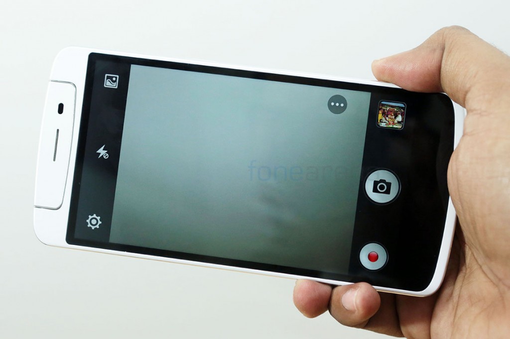
While it was disappointing to find that the camera does not have extensive controls for all the aspects of photography, like for example, there is no ISO or Exposure compensation controls to comfortably manipulate the image, the UI is still very minimalistic, which might be enough for most. Here’s a detailed video walkthrough of the UI, along with samples and thoughts on the camera performance -
Coming back to camera samples, we had taken several photos in different lighting conditions and use cases. We have compiled them below in separate galleries. Do take a look at the full resolution samples for better judgement.
Click to view in full resolution
Daylight
As you can see from the samples above, the daylight performance, even though washed out and under exposed sometimes, is pretty great. In ideal conditions, the N1 takes highly detailed photos with less noise and balanced colours. We would have liked less over blown highlights though, which completely washes out the photo, or under exposes it some times. Some of the under exposed photos in the gallery above are deliberate, you’ll know why, in the next gallery below.
HDR
As we had found with the Oppo Find 5, the N1 too takes great HDR photos. It is a saturated tone mapped image, but still the results are spectacular. We’d go ahead and say the N1 is better than the Find 5 due to obvious reasons – new algorithms and lenses. It’s near instantaneous, and produces detailed, post processed images that look like they have been done on desktop software. Here are some samples, don’t forget to compare them with the ones above -
Macro
Shallow depth of field? Check. Noise-free sharp details? Double check. The N1 excels at macro shots. Thanks to the f 2.0 aperture, the shallow depth of field creates a beautiful bokeh in all the photos that have a varied background. Take a look at the yellow flowers in full res and you will notice how awesome the bokeh effect is, which is startlingly close to some high end point and shoots. Focusing is a breeze and the N1 just takes great macro photos, period.
Low Light
Low light is a problem for any cameraphone, but the N1 handles it surprisingly well. It excels even in uneven lighting and provides a great picture, in HDR mode as well as normal. We agree that noise creeps in, in most pictures but lesser noise reduction in the algorithms bodes well for a sharper photo in low light and that’s good! Even the normal mode balances the scene nicely without over blowing highlights too much, as some scenes were way too noisy in HDR, which tries to overcompensate for the shadows. If only it had OIS, things would be even better.
Long Exposure
Equipped with a slow shutter mode, the N1 joins the rank of the Lumias as the one of the only devices having this functionality out of the box. The slow shutter mode takes advantage of the custom hardware and software and lets you have it open for 8 seconds or set it on Auto. Without a tripod and the O-Click bluetooth control, this is useless as it will definitely induce shake into the picture, but we did try it out handheld, check the samples -
We would have liked better control in exposure compensation, as the fixed aperture of f2.0 obviously goes against the concept of taking light trail pics on the Oppo N1, but we figure it is possible to take even some star stacked images with this device, if one has the patience.
Overall, an excellent stills camera, which could have been even better if OIS had been implemented and the UI had gotten better controls for exposure and image manipulation in real time. For establishing true camera supremacy, the aforementioned features as much needed, because the N1 comes really close to being the best 13 MP camera on the market.
Use as a front facing camera
One big advantage of the camera sitting on a rotating unit is its use as a high resolution front facing camera. The rotating unit can turn 206 degrees and is very flexible, as advertised. It was revealed during the launch even that Oppo had tested the unit for extreme stability, making sure it will last at least 100,000 rotations. We can say that the rotating unit is solid and is well built. Does not creak or loosen up after regular use. There is a neat trick in Color OS that enables auto launch of the camera when the unit is rotated to the front, which means that the unit does have an accelerometer or some kind of sensor built inside, to detect the motion.
As a front facing camera, the UI automatically disables any kind of extra features it offers in the normal mode. So, you have the normal and face beautification modes(ladies will love it) alone, when the UI flips over to match the orientation. The image quality didn’t deteriorate when in this mode, but it does have the same exposure problems the normal mode has. Sometimes, it is over exposed and washes out the highlights and even induces a crazy auto focus blur because the phone takes the photos even before the focusing is completely done. This problem arises when one uses the OTouch sensor for selfies, because it’s arguably the easiest way to do it, as the one handed selfie is near impossible on the N1, unless you use the volume rocker as a shutter button. That aside, we think the full resolution front facing camera enabled by a rotating swivel unit is a novel idea and we quite enjoyed using it.
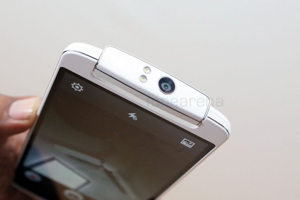
Having a rotating camera module also means that the flash comes to the front, which makes interesting use cases for the powerful flash that is generally used in low light. The dual mode flash, when turned to the front, produces a softer glowing light which improves the overall scene rather than illuminating just your face. The difference in the two LED flashes are clearly visible when you take a look at them up close. One has a glossy finish to it, while the other has a softer matte finish, which, we believe is used for the softer flash.
Video
Unlike the excellent stills mode, the video recording capabilities of the N1 are a little underwhelming. The phone can record a maximum resolution of 1080p at 30 fps and also has several modes. The resolution modes are – 480p, 720p apart from 1080p and the special modes are – HDR and Slow Motion. Talking of video performance, the N1 fails mainly due to lofty expectations set by the stills camera. The 1080p videos are jerky and have reduced details when compared to other cameras, but we found the stereo audio recording to be excellent. It produces ambient audio, capturing it in high quality stereo. The HDR video, which manages to have better saturation than the normal mode is hampered by jagged edges everywhere, due to extensive moire effects. That’s usually the nature of HDR video, as it combines different frames into one, and requires aliasing for perfection, which the N1 currently lacks, due to various reasons. The slow motion mode is a 480p 120 fps converted to 30 – which is hardly an improvement over the Find 5, and we see no discernible improvement here either. You can take a look at the video samples in our camera review video posted above.
Internals and Performance
Released in September of 2013, we had expected at least a Snapdragon 800 chipset inside, but unfortunately the Oppo N1 comes with a slightly older Snapdragon 600 Quad Core chip. Yes, this is a 1.7 GHz Qualcomm Snapdragon 600 Quad Core processor, with Adreno 320 doing the graphics duties. This is very similar to the Oppo Find 5, but manages to perform better due to optimizations and basically, higher clock speed. We ran various synthetic benchmarks to see how it fared in comparison with other devices, here are a couple of test which indicate the kind of performance that you would expect from Snapdragon 600 -
We noted that the performance is right in line with devices running on the same 1.7 GHz Snapdragon 600 chipset. But when compared to all the other flagships -
This is hardly something to cheer about, but we feel that the performance factor is very much determined by the user experience rather than just numbers. Also, at this point in time, we don’t have many demanding scenarios in which a better processor might fare better, and lets you achieve something great. Nope, it may well be the case for tablets, but for powerful phones, the Snapdragon 600 chip is just fast enough for most tasks, including gaming. We played a number of games on the Oppo N1 and found it to perform as expected. Gaming performance was fluid and smooth in almost all the games we tried, and earned itself a 4.5/5 star rating in our gaming review, watch -
For separate gameplay videos, you can watch -
Asphalt 8 -
NOVA 3 -
As you can see from the videos above, the Oppo N1 can hold its own in terms of gaming. But day to day performance is not bad either, with the N1 consistently performing fast and smooth. The Find 5 struggled a bit with its old Color OS, but the new one just flies and overall performs really well. The N1 also holds its own in terms of multitasking thanks to the 2 GB of RAM, which idles at around 870 MB when all the apps are closed and goes upto 1.6 GB when a lot of apps are running. We didn’t find it to be a deterrent to the performance anyway.
We have the base 16 GB version of the Oppo N1, which comes with 9.55 GB of user available memory and 2.96 GB of System memory where apps get installed, if you choose to. So totally we get around 12.5 GB on a 16 GB device, which is practically the same as every other 16 GB device we have seen and used, so no complaints there.
One problem we noted while flashing Color ROMs was that the residual data left from apps or games failed to get cleaned up automatically, so we had manually find and delete them to free up space. Just an extra step, but could have been nicer if it was handled automatically. Also, as expected, there is no micro SD expansion slot here.
Connectivity and loudspeaker
The Oppo N1 comes with support for GSM 3G HSPA+ networks in these bands -
- GSM: 850/900/1800/1900MHz
- WCDMA: 850/900/1700/1900/2100MHz
It also has all the usual connectivity nuggets including WiFi b/g/n, Miracast support, WiFi Direct, NFC, GPS and Bluetooth 4.0. The specifications in the product page state that the device comes with USB OTG support, but unfortunately we could never get it to work. We tried flash drives, PS3 controller and several other USB inputs that usually work with other devices, but they refused to even power on, with the Oppo N1. It’s certainly not a deal breaker of any sorts, but we definitely would have liked the option, especially for gaming using a PS3 controller. Call quality and network performance was flawless on the N1, as we had tested on the local Vodafone network. Only issue was that the device doesn’t get recognized on the network for data, so we manually had to enter the APN. It does work, but a small quirk we noticed. Speeds met expectations and callers on the other end found no problems with our voice, so you are basically covered in terms of basic functionality. The loudspeaker, although not as good as the Find 5, is very loud and clear. It is great for music as well as calls, but damn, we miss those awesome Dolby enabled speakers on the Find 5. We would have definitely liked to see it make a comeback on the N1, but unfortunately that isn’t the case.
All this connectivity is awesome, but only when properly used, and thankfully, Oppo bundles its own low power Bluetooth accessory called O-Click.
O-Click
The O-Click is a diminutive Bluetooth accessory that goes along with your key chain. It has several functions and uses but is barely bigger than a coin. Attesting to its name, the O-Click has a button and a notification LED.All you have to do is, load up the standard button cell and click the button to start pairing it with the N1. The O-Click app on the phone takes care of the rest by pairing it and offering valid use cases with it.
It can make up for the lack of a notification LED on the phone, by prompting you with light on all the phone’s notifications, it can also be used as a remote shutter for the camera, which might be useful for group shots. But there are more use cases, like for example, a double click on O-Click can make your device ring so that you can find it in your home without the frantic hyper ventilating search, or you can make the O-Click beep from the phone, if it loses range, an anti-lost mechanism, or to just find the O-click faster, in case you misplace it.
We found the accessory to draw very less power from the phone in terms of Bluetooth, so overall a great accessory that is provided by default inside the box. It is an integral part of your hardware if you use it well. For people who always misplace their devices, this will be immensely useful. We are just waiting for an opportunity to set the N1 on a tripod and taken long exposure shots using the remote shutter on O-Click! A great Bluetooth accessory given for free, only downside we can find is it needs to have its battery changed, as the button cell is not rechargeable.
O-Touch
Lastly, as a part of the N1′s hardware, we have the O-Touch rear touch sensor. This is a 12cm^2 area that recognizes touch, but is limited to a small number of gestures and inputs. It’s main reason of existence is because the N1 is too big, and is unwieldy for one handed use, which might be improved by the O-Touch. Initially, it was a bit wonky, but we found it got better with software updates. While not that useful, we used it to trigger selfie shots or launch specific apps on double tap(It’s set to camera by default). The slide and swipe works inside most third party apps but surprisingly not in the default browser – Chrome, which is a bummer. It’s not exactly a touch screen, so it doesn’t act like one because that would require a different level of design. The touch area is marked on the back, and needs getting used to, however we feel it is in the right place, as we had slowly gotten used to it over time.
The O-Touch functionality can be quickly enabled or switched off from the notification quick settings panel, which we find very helpful because most of the times, when we are not using O-Touch, a lot of untimely touches happen that ruin the experience.
Here are all the options it offers -
Our verdict – It’s nice to have for selfie shots or to quickly launch an app, but not that great otherwise.
Software
Software on the Oppo N1 is a choice. The device comes with the company’s own Color OS based on Android 4.2.2 JellyBean out of the box for the international version, but you also have a freedom of choice to load up Cyanogen Mod or any other supported ROM that you choose. This freedom is unique to Oppo devices as it comes with a unlocked bootloader as well as a stock recovery that can happily perform installation of custom ROMs. There is also a International limited edition Cyanogen Mod N1 that will go on sale this month, and will run CM out of the box, but what we have here is the normal international edition that runs Color OS, Oppo’s own thoroughly customized offering based on Android 4.2.2. Lets see what it packs, in terms of worthy features in general.
Launcher screenshots
Based on Android 4.2.2, we saw that the Oppo Find 5′s variant of Color ROM came with a custom lock screen that disabled any kind of lock screen widgets, but thankfully, the N1′s lockscreen is stock and can add lockscreen widgets for Google’s services, and of course, other third party apps. There are no visible lock screen widgets for first party apps though. The homescreen arrangement is similar to the Find 5, with the ability to add full screen widgets, aka spaces, for photos and music. We found it handy when, much like TouchWiz, Color OS automatically created a music space when earphones were plugged in. Building upon the previous version, the Color OS on N1 allows customization of the launcher to your tastes, with the in-built themes app. There are a lot of online themes available, from which one can choose to install it in local and enable whenever needed.
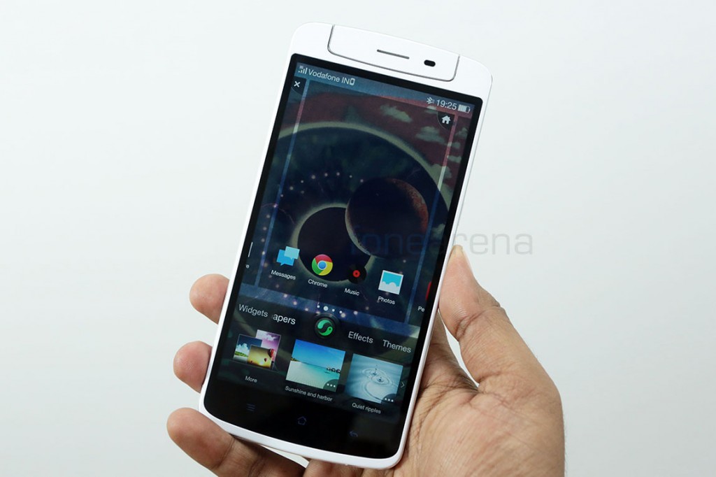
Pressing the contextual menu button on the homescreen will let you select themes, change wallpapers for lock/home add effects between homescreen pages or as usual, add widgets. The green button in the middle is for the dedicated spaces we talked about. Surely, there are a lot of customization options here, which should be great for power users. You can always switch between launchers if needed. The notification panel on the top has a huge 3-row quick settings panel that collapses or expands on a swipe. Being a huge device, it’s good to know that Color OS makes things slightly easier, mainly in the home screen. You can swipe down from any blank area on the homescreen to pull down the notification bar, yes, you don’t have to reach up to the status bar. You can also swipe up on any of the dock icons to brings the contextual menu up. While this kind of usability is though of, it is completely non existent when it comes to apps or even the general UI.
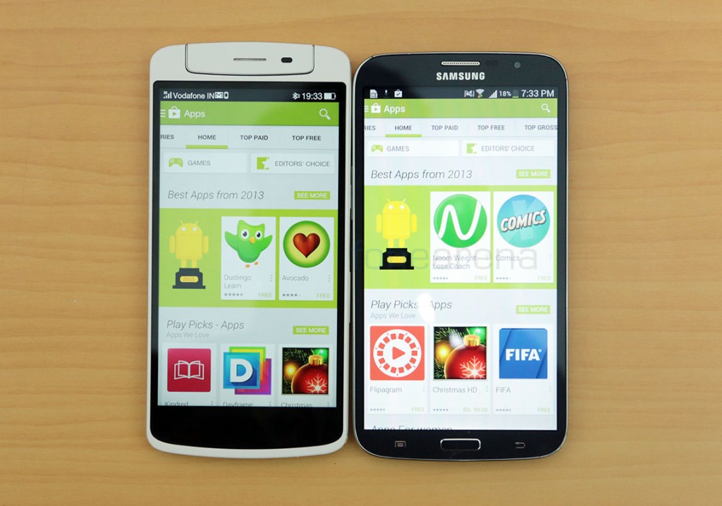
Scaling is very important for large screen devices, mainly because it serves the purpose of showing more information on a single page. That’s one of the major reasons why large screen devices are bought, but unfortunately that’s not the case with the Oppo N1. It doesn’t scale exactly well to the 5.9 inch screen. Apps looked to have bigger bars and bigger text generally, making the display look stretched out rather than being actually big, like for example the Galaxy Mega 6.3(pictured above) which scales content better. This was a problem we saw with the HTC One Max as well. This can hopefully be fixed with a software update, and we hope Oppo delivers, using this as feedback. That aside, the Color OS is all about offering various features and great default apps, lets talk about them.
Gestures
Gestures are an integral part of the N1 experience. Mainly because it makes doing some actions so much easier. Under Gestures and Motion in settings, we have a ton of listed features. Some of the best ones are -
- Rotate the unit on the top to open the camera
- Double tap to wake screen
- Open the camera from locked state by drawing a circle
- Open flashlight by drawing a V (or long press home button in lockscreen to immediately launch flashlight)
- Two finger gestures for play-pause music player in locked state
These are our picks, that we regularly used and enjoyed on the Oppo N1. Sure there are a lot more gimmicky gestures that resemble Touchwiz features, but these are the ones that we found usable, but that’s entirely subjective. You can take a look at the full list of gestures here -
Preset gestures aside, what’s even better than making your own gestures and letting them do your own custom actions? Yes, it’s entirely possible on the N1, thanks to the quickly accessible gesture panel on the top down status bar, which will open up if you swipe down from the operator name. There are two preset gestures here and you can add more for more actions.
Default apps
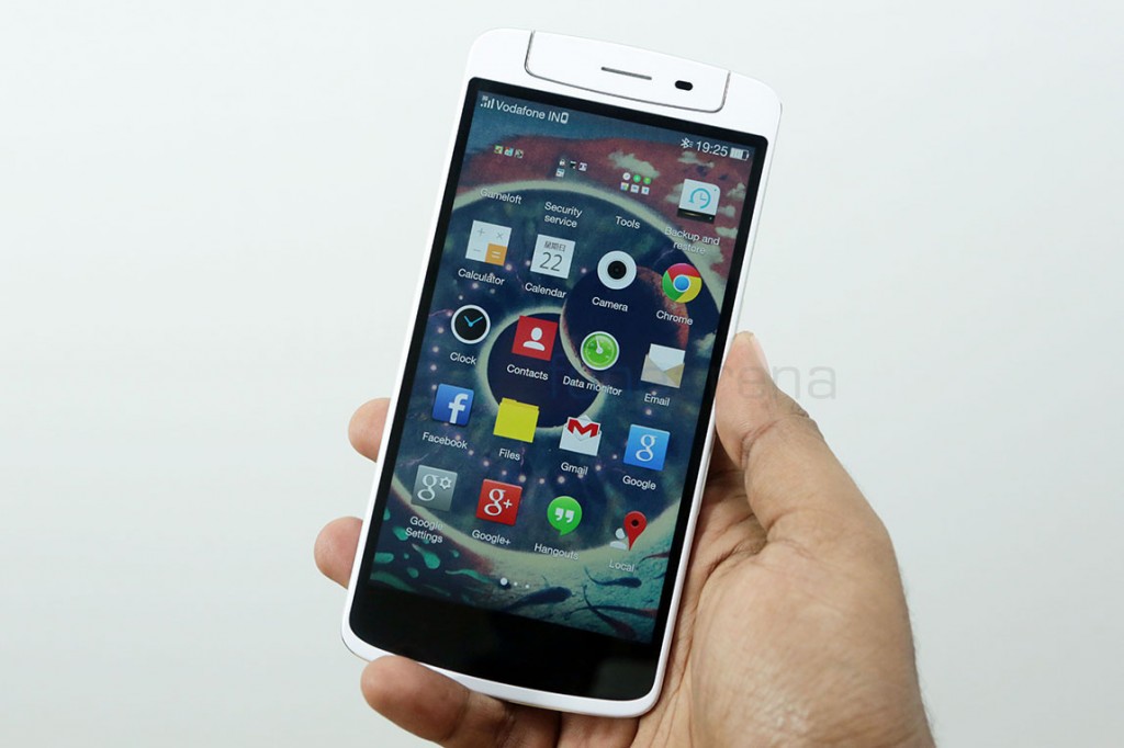
As we had seen with the Find 5, Oppo’s default apps are delightfully designed. They are skueuomorphic, but there is a stark minimalism about them, which makes using them so enjoyable. Default apps like video, photos, weather and even calculator are aesthetically pleasant and offer all the functionality you’d expect. However, we found it curious that Oppo has completely done away with Dolby or Dirac audio options in the music player, suggesting that the hardware or the software hooks that are required to enable these features don’t exist on the N1. The Find 5 had it, and it made the device’s music capabilities awesome, but it’s terrible that the N1 couldn’t have the same, but the audio quality over earphones is great, but just not like the Find 5. Oppo’s own special app collection includes O-Cloud which is a cloud service that lets you back up important stuff like contacts and messages, and also acts as a service to find your phone through the cloud if lost. Screenshots of all the default apps and more in this gallery below -
Battery Life
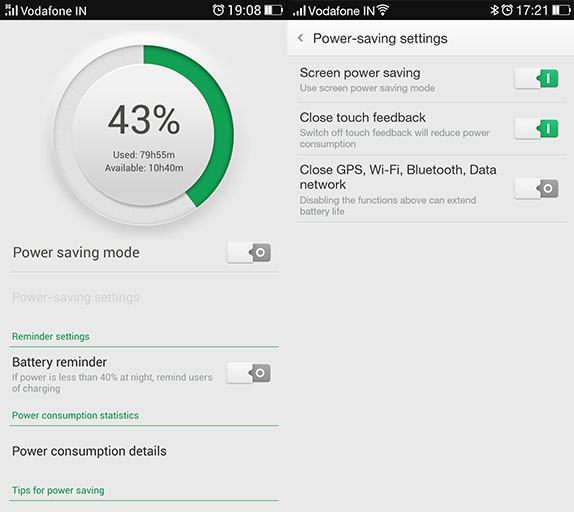
So, there’s a whole lot of hardware and software features on the Oppo N1 that is not found on other phones, but that also means that battery life will be a huge concern, especially when we have gestures that work when the screen is turned off. Thankfully, the N1 has a big enough battery to compensate for the overload of battery sucking features. The battery, rated at 3610 mAH of capacity is sealed inside the phone and non replaceable but that’s not a problem since it lasts really long, even under heavy use. Automatic brightness, O-Touch, constant use of Twitter, Whatsapp and the camera didn’t even dent the battery life in way we expected it to. It still lasted more than a day, with more than 4 hours of screen time and still 17% of the battery to spare. We saw this pattern again and again over the course of our review, and we can just say the battery life has been great for us. Average user? You can get 2 days out of this easily, or even more, if you enable the power saving mode. Overall the battery life is great, and it is generous enough to allow us to use O-Click and the Pebble SmartWatch without draining the battery within a day.
Conclusion
As mentioned early on in our review, the Oppo N1 is a phablet first, flagship second. Meaning, the device is applicable to you as a flagship only if you agree to the idea of a phablet sized device, which is highly subjective to one’s preferences. In case you agree to the idea, like millions of others, then you would be glad to know that very few devices are as well designed and well built as the Oppo N1. That speaks volumes about the company’s dedication to produce quality hardware in the high end. If you are paying a premium price, you are getting premium or even the best built hardware in the market, that’s Oppo’s promise, along with various other innovations and quality components added into the mix.
Apart from a number of firsts like the O-Touch rear sensor, the rotating swivel unit for the camera and clever hardware dependent gestures, the Oppo N1 also has a great full HD display, a superb camera for stills and good performance overall. It’s great on the software side too, with the Color OS offering plenty of customization and nice gesture based features with the choice of Cyanogen Mod a valid bonus point generally. But we did feel the OS doesn’t scale well to the huge screen, which is something we want to see Oppo fix in a software update. On the hardware side, we felt a simple micro SD card slot and a better video mode would’ve fixed the only problems we had with hardware. Oh, and we wish it ran on Snapdragon 800 which would not only make it faster, but future proof too.
At $599, the Oppo N1 increasingly looks like a great deal for any one in the market for a flagship phablet device. It’s cheaper than the Note 3 or the HTC One Max for example, but with obvious tradeoffs of the lack of expansion and stylus support. With the world moving towards bigger and bigger screens, Oppo might have taken their best bet in the form of the N1, which, along with excellent hardware and choice in software(thanks to Cyanogen Mod), makes it one of the best options out there. To make your decision easier, here is a list of Pros and Cons of the Oppo N1 -
Pros
- Very well built, feels premium
- Great display – crisp, bright and has excellent viewing angles
- Great stills camera, possibly the best 13 MP camera out there
- Well designed OS and default apps with useful gestures
- Choice of Cyanogen Mod – Stock Android FTW
Cons
- Big and heavy – might not suit everyone’s needs or tastes
- No micro SD expansion or USB OTG – much needed for a media consumption focused device
- Poor video camera – needs to get better
- O-Touch works, but doesn’t offer great advantages to one handed usage
- Scaling of OS and apps needs to get better